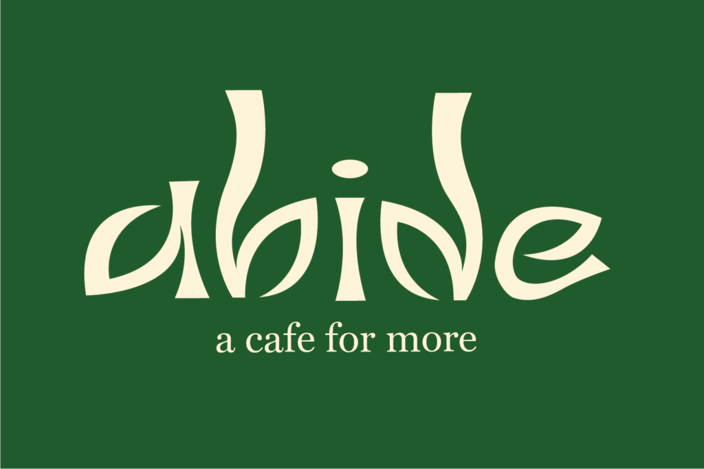
Abide
Caitlin Cheung
PROJECT OVERVIEW
a cafe for more.
To abide by something is “to live in accordance with it”. Whether we choose to admit it or not, we all abide by something, whether that’s school, a relationship, a career, etc. Everything we do becomes influenced by this main thing, and it drives the choices we make and shapes our lives. As we go through life, how we choose to approach trials and tribulations is a result of our character. This is a question of our values as individuals and what we prioritize in our lives.
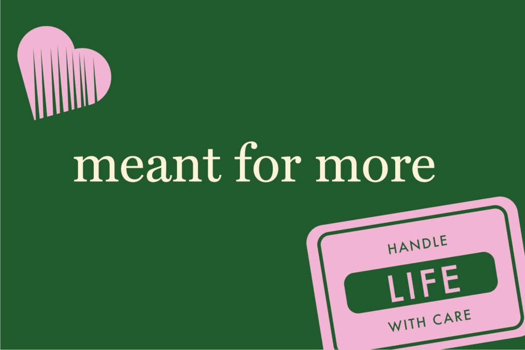
Abide is a project born out of my personal beliefs on what it means to be a good person and to live a good life. What began as thoughts in my head about the life I wanted to live post-grad became a cafe brand centred on living life with meaning and purpose. Abide was born as a space for people to reflect and to be a brand that openly inspires individuals to think about their lives and to handle life with care.
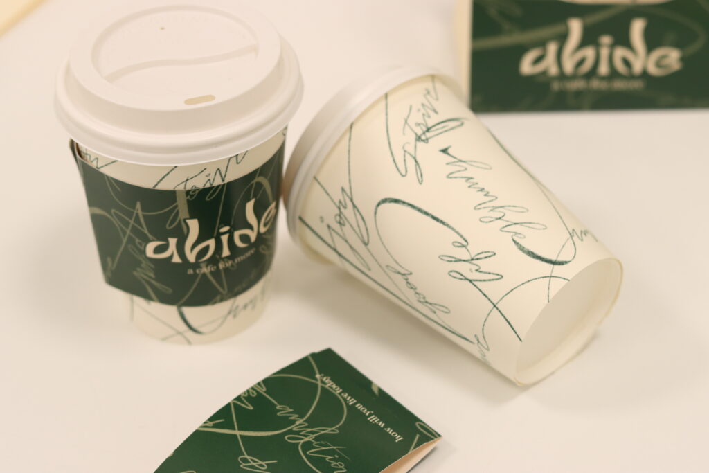
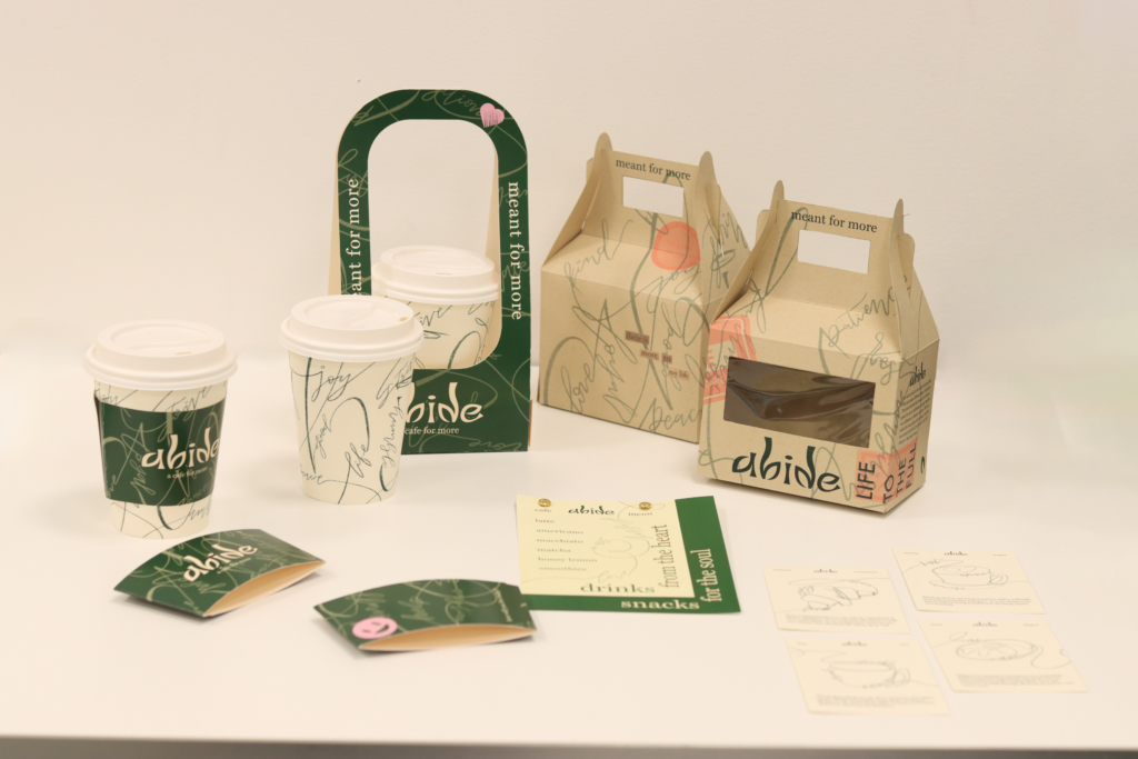
THE BRAND
authentic & aesthetic
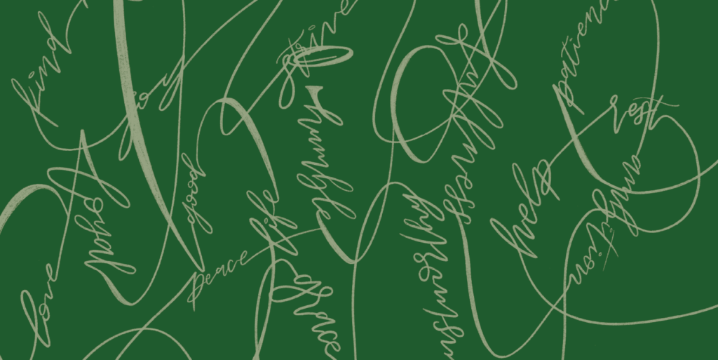
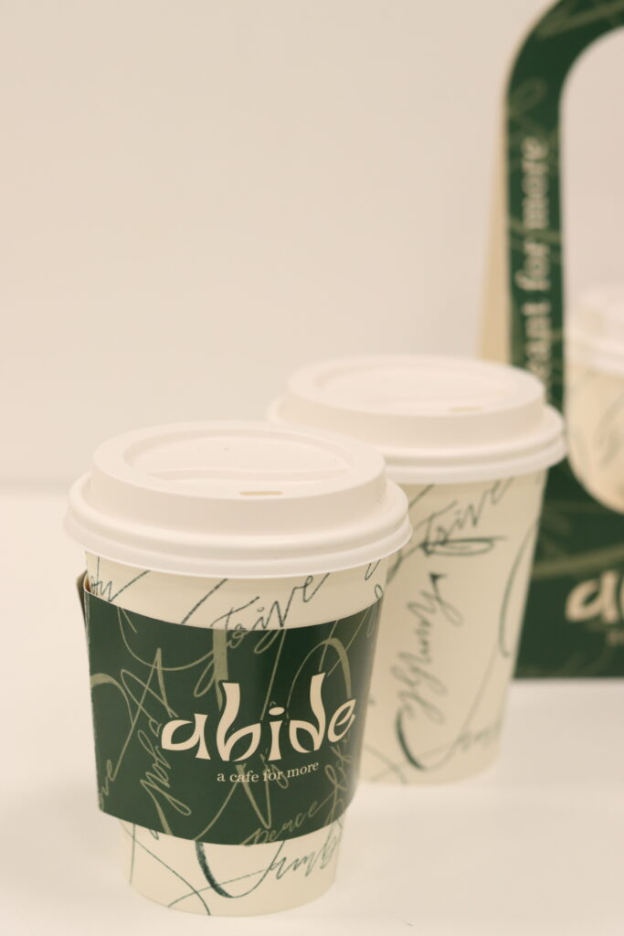
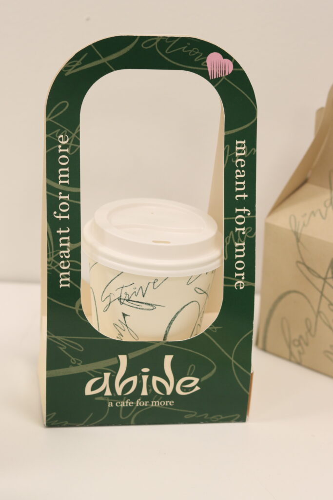
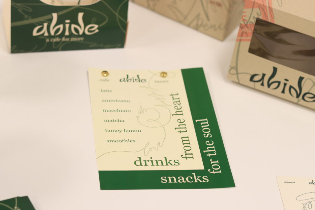
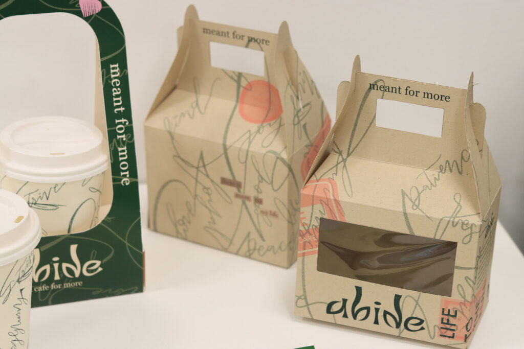
The main brand features an inviting and prominent logo created from leaf shapes. It represents growth and beauty in detail. Many assets are supported by a handwritten background highlighting many traits that a good person carries. The sketchy and flowy lines convey the idea of an ever-changing life built up of our choices and how we choose to live.
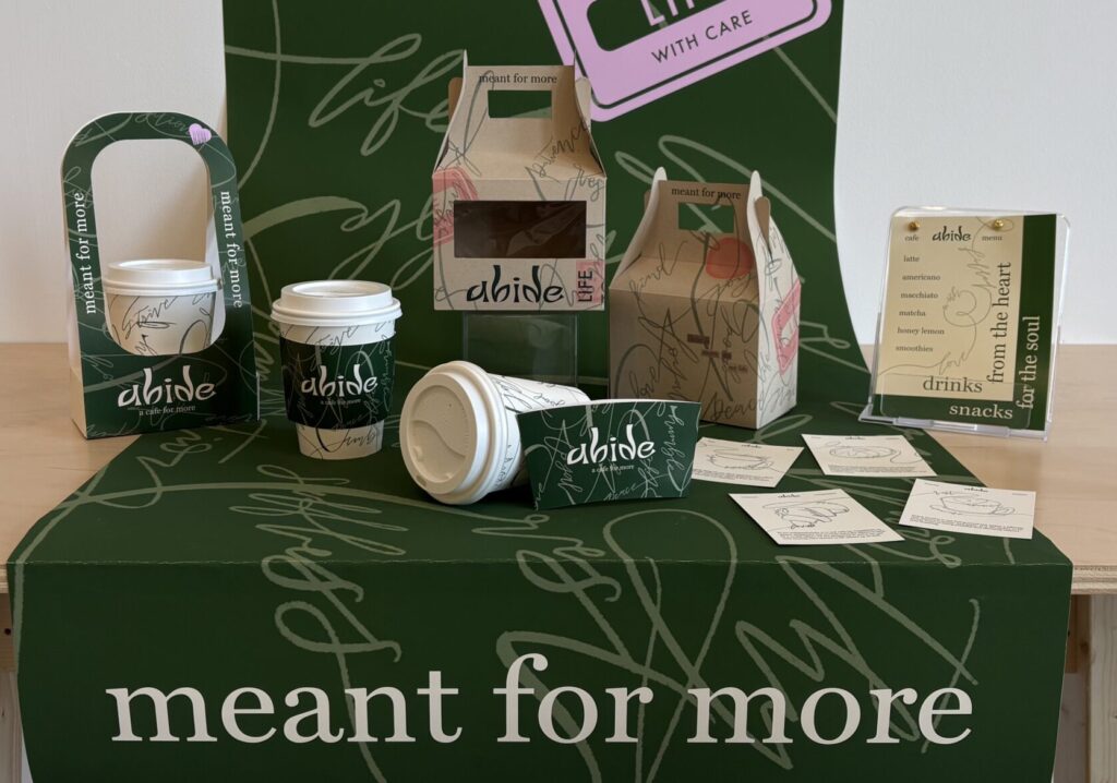
ASSETS AND OUTCOMES
In translating the brand into cafe assets, the main goal was for the branding to be seen and for the touchpoints to be an intentional point of conversation. Adapting trending aesthetics into this brand invites people to be curious and allows them to easily align with its purpose. It also creates space for people to take charge of the pace in which they choose to interact with the brand. It can stay as a “typical” cafe, but can also hold space for those who do choose to go deeper.
Each asset features the pattern design in its own way, along with a cohesive theme of blurry lines and rounded forms. They each support the brand and translates them into touchpoints for people to interact with.
MY HEART BEHIND THIS
why abide?
I created this brand as a way to explore my thoughts towards graduation and the rest of my life. Growing up Christian, I always had this way of life – this thought that there was more to life than this, and that life was about more than just having the most material wealth and success that the world seems always to promote. I had this understanding that the way I chose to live and how I treated others was much more important than selfish gain. I wondered if others thought the way I did or could even consider this way of thinking. Abide comes from John 15, highlighting life with Jesus as a vine and branches. It made me realize that we as people are rooted in something, and whatever that is affects all of our decisions.
I grew up around family and people who always inspired me to be better every day. During the preliminary stages of this project, I realized this wasn’t because they were super rich, had the best job, or were famous, but because they were kind, loving, and put others before themselves. It made me realize that it wasn’t about material wealth but about character.
Abide exists not to answer the unknown, but to create space for these thoughts and feelings.
I do want to be rich, though – rich in love, kindness, joy, and all that life has to offer.
rich in life.