TONGUE IN CHEEK
Anastasia Brovkina
See it On Campus: Level 1
Located in the photo studio on the 1st floor (D1385). It is one of the first few rooms on the right when you enter through the Carolina St. entrance.
Visitor Info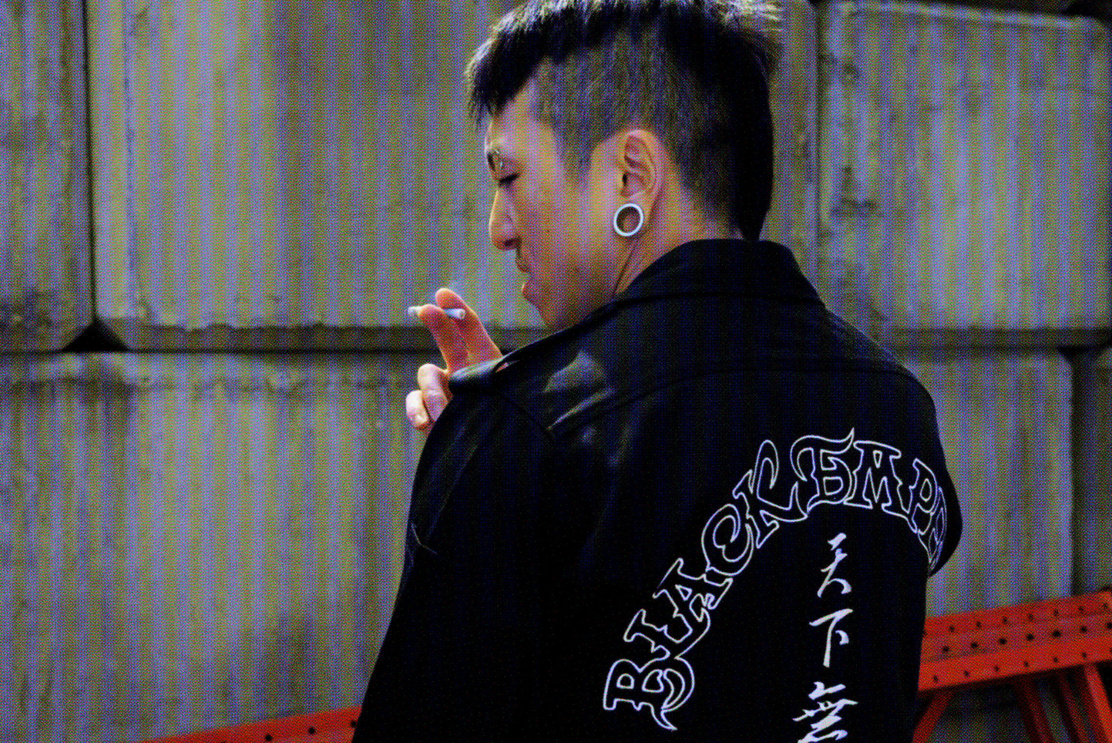
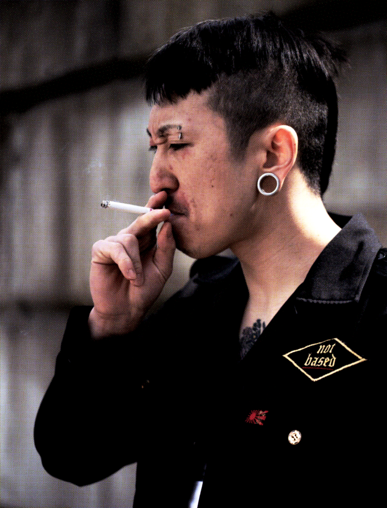
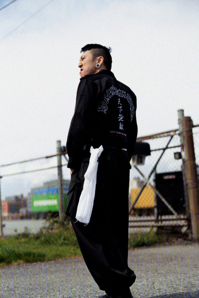
A “tongue-in-cheek” design project that embraces the extremely excessive and exclusionary aesthetics of tokkōfuku (“special attack uniforms”) worn by the bōsōzoku, (“violent speed tribes”) in order to satirize increasing political polarization amongst youth online & irl.
DISclaimer
This work examines the aesthetics of a subculture whose origins are tied to Japanese nationalism and imperialism; any visual language used in this project that is inherently associated to these ideologies is presented for critical and satirical purposes only and does not glorify them. This work does not endorse violence or political extremism.
Context
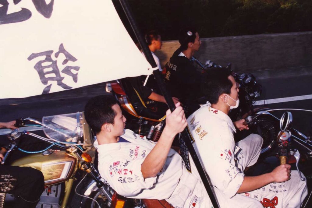
The bōsōzoku are Japanese delinquent biker gangs known for recklessly riding in large groups, their aggressive & violent behaviour, and distinctly obnoxious appearance.
Groups would fight each other, and often involve police and civilians as well.
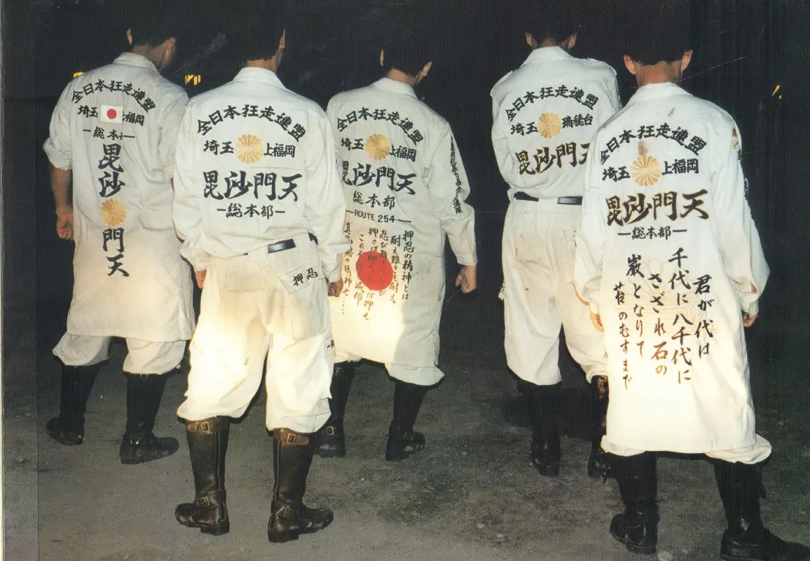
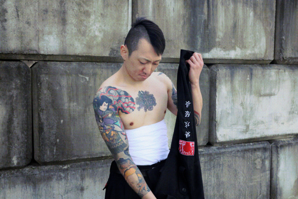
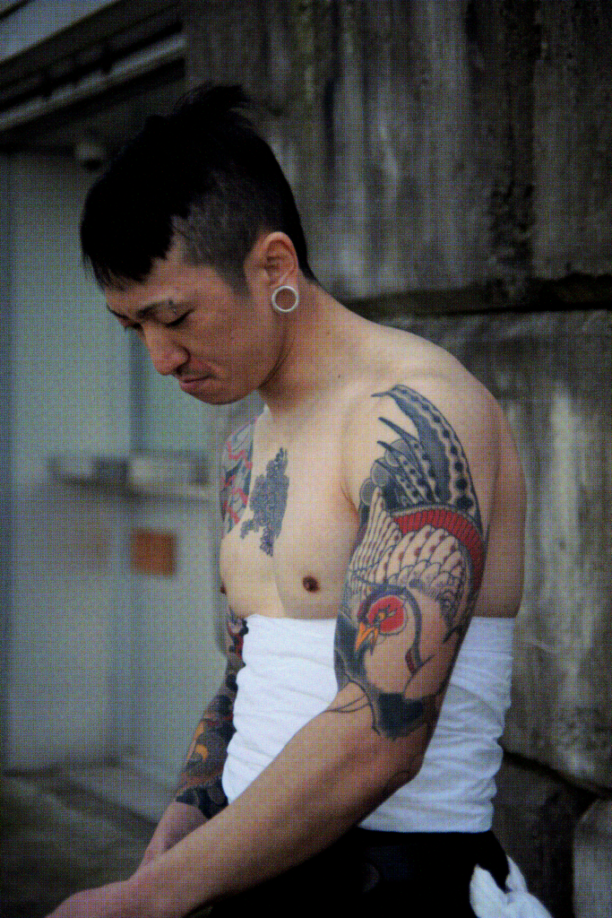
The tokkōfuku are heavily embroidered pseudo-militaristic “assault” uniforms worn by members of the bōsōzoku while riding. Originating from workwear worn by manual labourers, modified school uniforms, kamikaze jumpsuits and right-wing uniforms, they became personalized surfaces for self-mythologizing, symbolizing devotion to their chosen family and ultimately a means of self-expression.
The tokkōfuku frequently incorporated militant references, so there is heavy use of nationalist quotes and words, symbols like the rising sun and imperialist motifs which preserved the bōsōzoku’s connection to Japan’s controversial past.
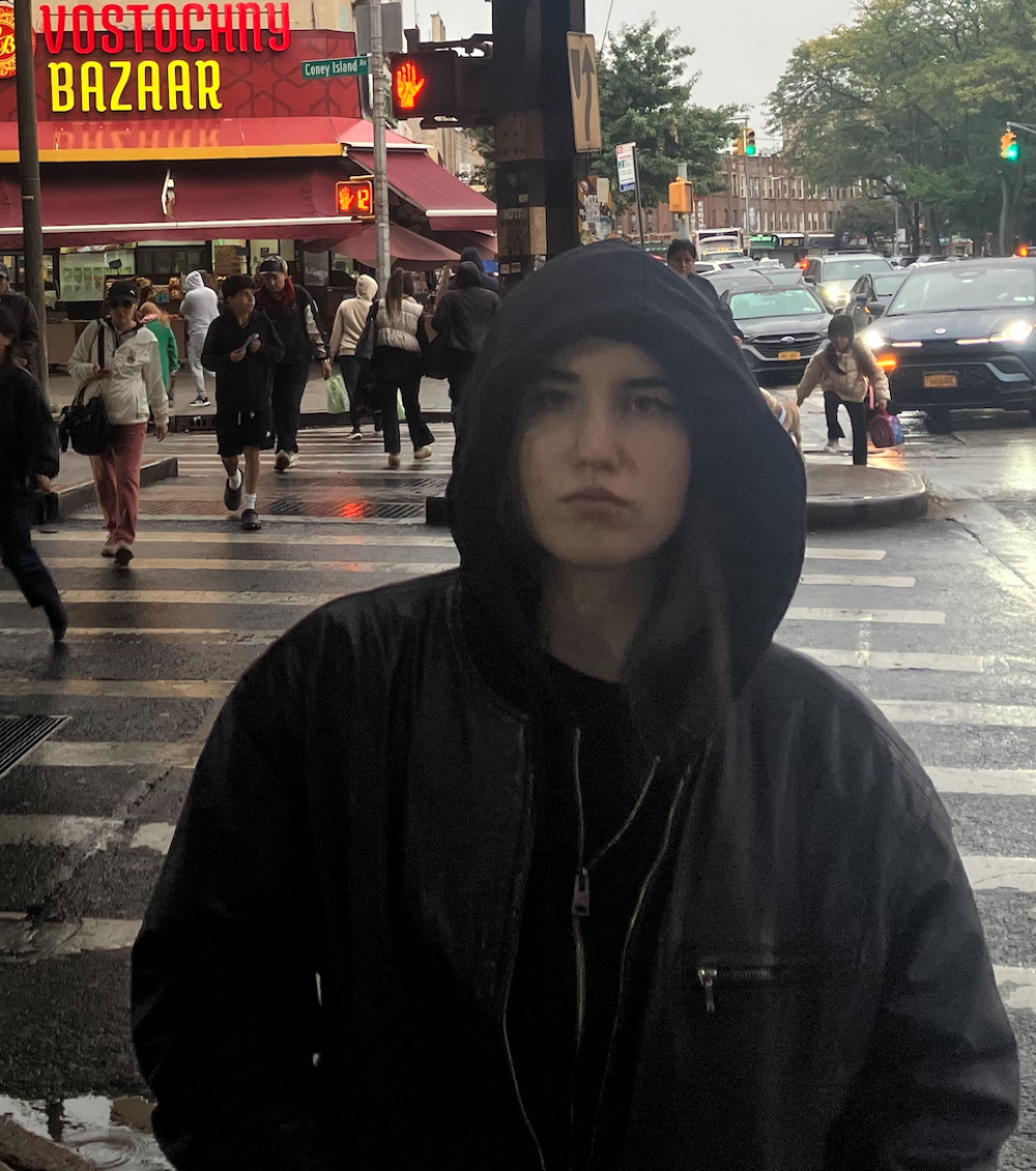
The Tokkōfuku
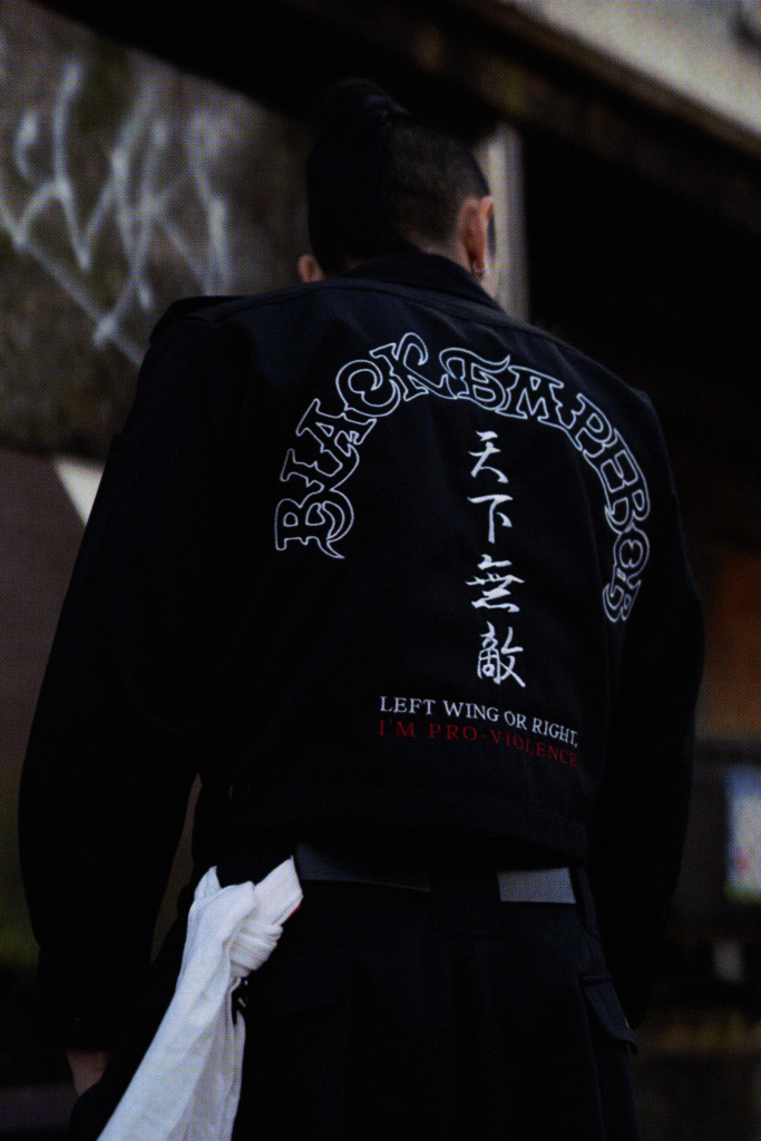
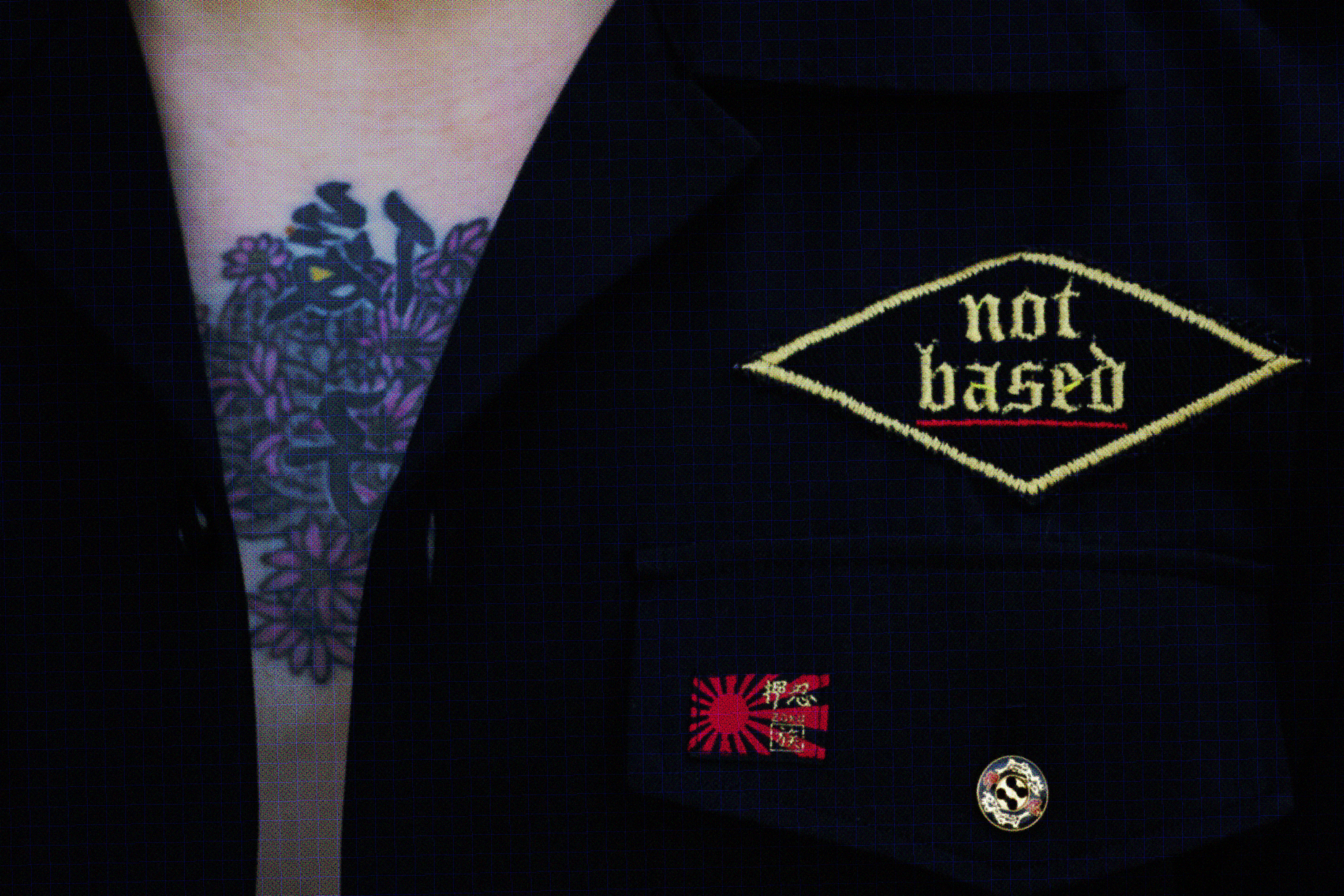
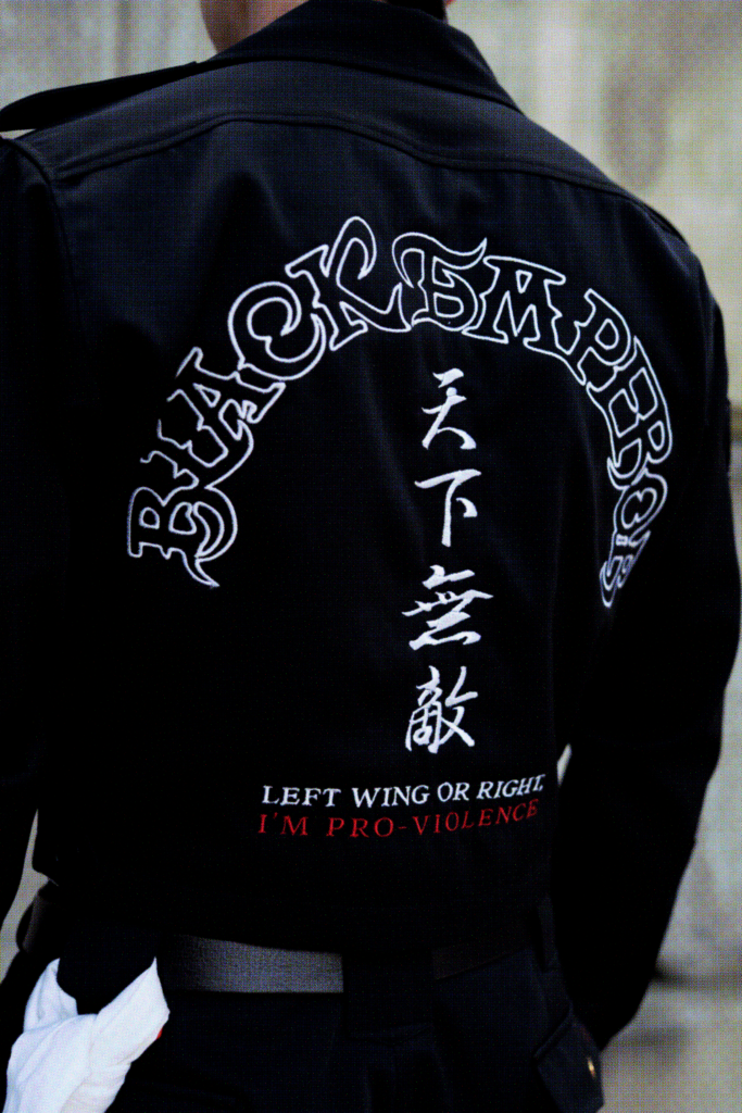
“Left-wing or right, I’m pro-violence.”
— Yukio Mishima (1969)
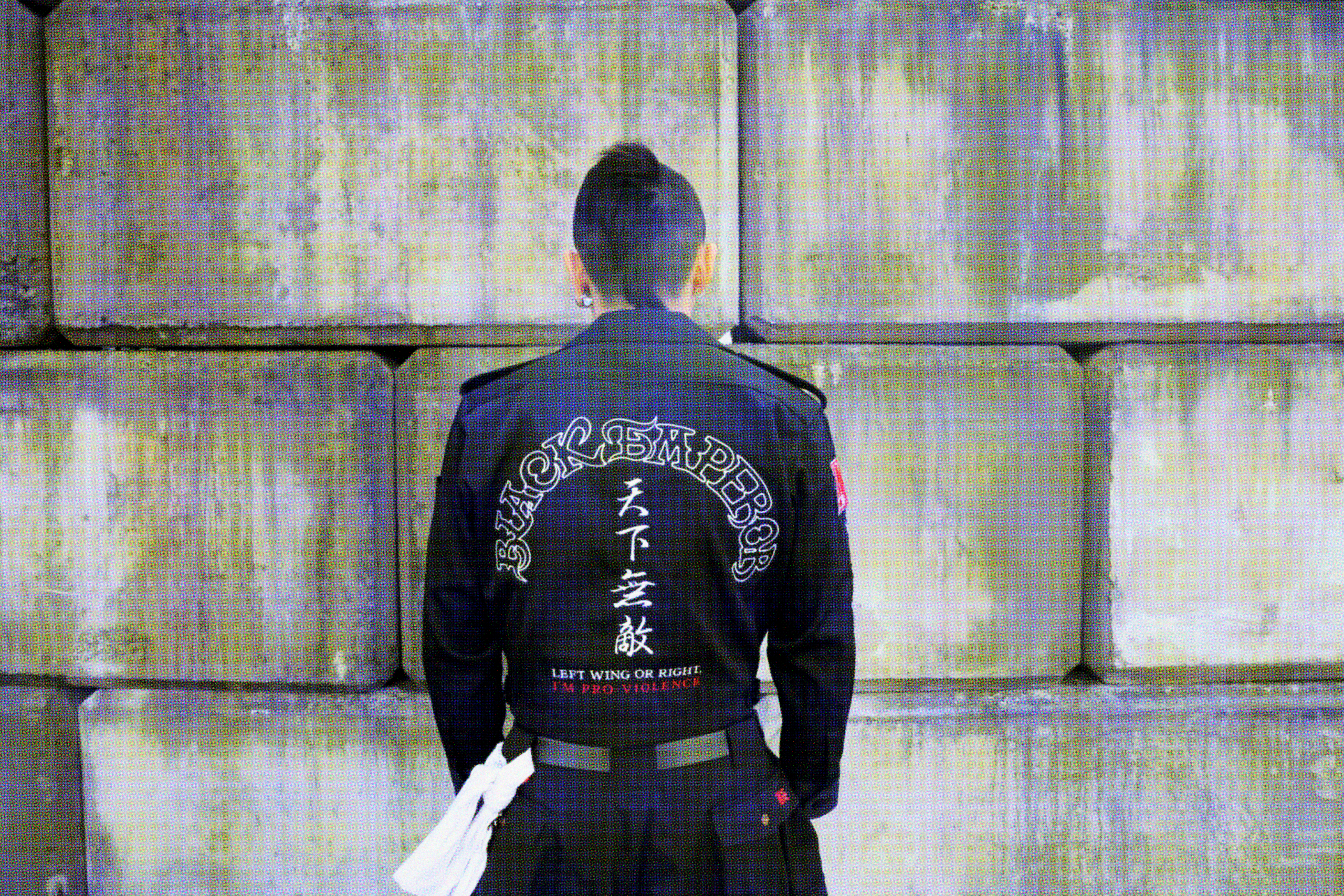
The phrase embroidered across the back of the garment references a quote from Japanese author Yukio Mishima. It’s a rejection of all politics and rigid ideological identification in favour of violence as a liberatory mode which offers rupture from the bourgeois social order. The statement operates less as a literal political position than as a refusal of black-and-white thinking. Contemporary political discourse increasingly demands that everything be categorized as either left or right, yet lived reality rarely exists so cleanly within those boundaries. It is choosing to live outside of those constraints.
By exaggerating historically charged visual language and symbolic affiliation, the work embraces irony and parody to mock political identity.
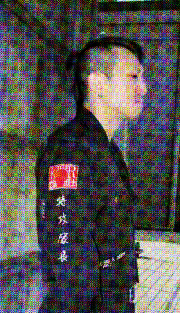
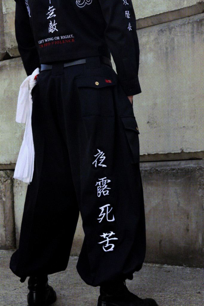
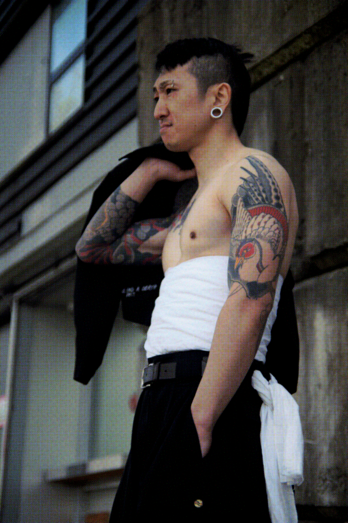
The embroidery on the pant leg, YOROSHIKU, references a stylistic rewriting commonly associated with Japanese delinquent culture. While the phrase means “pleasure to meet you” or “let’s get along,” each substituted character holds another meaning: night (yo), voyeur (ro), death (shi), suffering (ku).
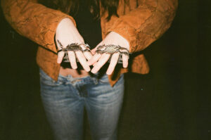
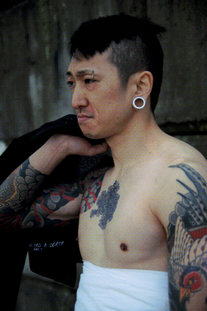
Special thanks to Lendai Kita for modelling & David Ho for photography.